Here is the link for a survey asking questions on my final video:
http://www.surveymonkey.com/s/TFWBQ3V
I would appreciate if everyone could answer the questions
Thank You :)
Tuesday, March 26, 2013
Wednesday, March 20, 2013
Final Digipak
Here is the final draft for my digipak. After my draft I really wanted to play around in Photoshop and make the images more fun, and that's where I got my cartoon idea from. I also used a lot of saturation and hue tools to edit colours and make them pop, so it give the images a really fun feel which is how I want my artist to be represented.
Below are some screen shots of effects I have used.
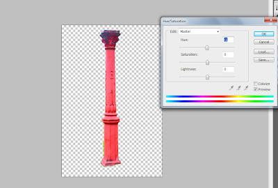
I used the hue/saturation tool after cutting out the pillar to adjust the colours in order to re-create the cartoon-feel I demonstrated on the front of the digipak.
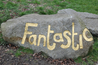
To add the cartoon effect to the rock, I first removed the background. Then I went around the outline using the pen tool. I then added two effects of the top, film grain and then paint daubs in order to create the cartoon effect. Next, I added a drop shadow and again played with the hue in order to create the cool, multi-coloured rocks featured in my digipak.
I then added the same changes to the tree to create the same cartoon effect.
Next, i added in a cartoon background of a sunny day and used the rectangle took plus filters to create grass. i then added all the cartoon elements in to create the full image.
I then added myself into the picture and played with hue and saturation as well as colour levels on certain layers such as the rocks and tree to create a more colourful image. I cut myself out of the front image I used in the first draft and then placed myself into this scene as it depicts the same image, but in a more fun, cartoon way which helps exaggerate my star image. In order to make myself stand out in the image I added a slight light yellow glow around me and again adjusted the colours to make myself more prominent in the image.
Thursday, March 14, 2013
Friday, March 8, 2013
First Draft Digipak
For my first draft, I wanted to play around with effects and colours within photoshop and above is what I managed to come up with. I want my star to seem fun, therefore by intensifying the colours, it adds a sense of fun to the image. Also in brightening the greens it really makes the nature aspect of folk music clear and a key part of the images. I also wanted the back and the CD to look authentic, so I played around with lables and text to achieve the effect I wanted. However I don't think it looks very proffesional at the moment, therefore in my final draft I will look at actual CDs to replicate the conventions. I also aim to create a cartoon background for all my images, taking photos of trees and various aspects of the park, and making them into cartoons to place my artist in. I think this will work better with my star image as it is more fun and girly, and still shows the nature aspect of folk genre. I also feel like my artist's music has a quite young, pop feel to it, therefore by using a cartoon it again makes it bubbly and fun, which will attract my target audience.
Tuesday, March 5, 2013
Photo Manipulation
This is the image I indend to use on the back of my Digipak. I wanted to again adjust the colours to make the artist stand out in the background. I duplicated the layer and then turned the top layer a red sort of haze in order to make the pillar and my artist's cardigan stand out.
After this I used the background eraser tool to erase the background and return it to green. Then I used the blur tool so that the focus is on my artist. Next I used the lasso tool to highlight my artist (as above) and then I increased the yellow in the colour adjuster in order to make the guitar and her hair stand out. I then used the background eraser tool again to erase the yellow haze on her dress and face, in order to make certain features stand out.
This is the image I aim to use on the inside of my Digipak. Firstly I again duplicated the layer so I could adjust the colours. The first thing I did was increase the green so that the greens in the background stand out in order to connote to nature as part of the folk genre. I then used the background eraser tool to erase my artist out to stop the green tinge on her. I then used the blur filter to soften the edges around her and draw focus to her in the image.
I then repeated what I did above but with a red colour adjust instead to make the cardgian stand out.
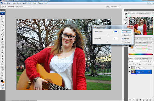
After doing this I then realsed that my artist face had been dimmed by all the colour adjustments, so I used the magnetic lasso tool to accurately select around her face and neck and increased the brightness so her face became more clear and stood out.
I then also realised the guitar didn't stand out as much as I had hoped, so I selected it again using the magnetic lasso to get a smooth cut and increased the yellows to restore the guitar to a more normal colour.
And this is the final outcome :)
Final Filming
Our final filming date was on the 21st of Feburary, in which we went back to the park and re-filmed some of the couples shots and added in a new scene to link the two scenarios shown. Also, we filmed some more movement shots in order to show more diverse shots in our video. The weather again was an issue as there were frequent small snow flurrys while we were out, however it wasn't bad enough to stop filming so we worked through it. We were going to also take some pictures, however it was too cold and wet to get the shots we wanted. So for now we are focusing on finishing the music video and then we will work on the Digipak and Advert.
Editing Rushes
Firstly, as we had a lot of different clips it was important to organise them into bins (folders), so we filtered them into scenes and days so that we could easily find the clips we wanted. This saved time as it became easier to edit knowing where everything was.
Another thing we had to learn to do was how to speed a clip up so that it fit in with the editing pace, as sometimes they looked better when the action is played faster. For this we increased the speed by a percentage (which you can see above) and did this on the actual timeline rather than the clip, which made it easier to change if we needed to.
The hardest thing we had to learn was how to create a split screen, as it was really tricky to get it perfect. For this we had to place one clip on top of another and then crop/resize the image so that they both could be seen. Above is a picture of us re-sizing the images and moving them so they are the same size and are next to eachother.
Above is the finished split screen and you can see in the time line that one image is placed on top of the other to create this.
We also used a lot of cross dissolve transitions to blend images and link scenes to make the narrative clearer.Tthis was relatively easy, as you selected the two clips and added the transition between the two. You could then adjust the speed and time that you want it to take by clicking on it and dragging it to how many seconds you wanted.
At the end we wanted to desaturate the image and make it dull to show that something had gone wrong and emphasise this as the sad part of the video. To do this we went to effects, then video filters, image control and then desaturate. We could then decide how much colour we wanted to take out and this created a really good effect in the video.
Here is just a shot of the timeline and as you can see it has multiple different clips within it to make the cuts in the video quick and entertaining. This was also helpful as we could cut to the beat and effectively get the syncing perfect so everything was in time and looked proffesional.
Subscribe to:
Comments (Atom)


