Here is the final draft for my digipak. After my draft I really wanted to play around in Photoshop and make the images more fun, and that's where I got my cartoon idea from. I also used a lot of saturation and hue tools to edit colours and make them pop, so it give the images a really fun feel which is how I want my artist to be represented.
Below are some screen shots of effects I have used.
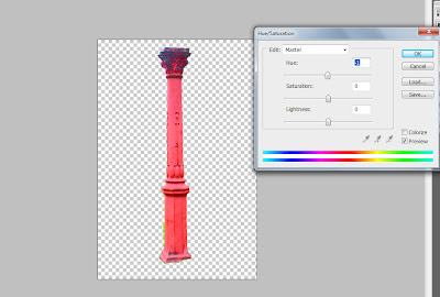
I used the hue/saturation tool after cutting out the pillar to adjust the colours in order to re-create the cartoon-feel I demonstrated on the front of the digipak.
To add the cartoon effect to the rock, I first removed the background. Then I went around the outline using the pen tool. I then added two effects of the top, film grain and then paint daubs in order to create the cartoon effect. Next, I added a drop shadow and again played with the hue in order to create the cool, multi-coloured rocks featured in my digipak.
I then added the same changes to the tree to create the same cartoon effect.
Next, i added in a cartoon background of a sunny day and used the rectangle took plus filters to create grass. i then added all the cartoon elements in to create the full image.
I then added myself into the picture and played with hue and saturation as well as colour levels on certain layers such as the rocks and tree to create a more colourful image. I cut myself out of the front image I used in the first draft and then placed myself into this scene as it depicts the same image, but in a more fun, cartoon way which helps exaggerate my star image. In order to make myself stand out in the image I added a slight light yellow glow around me and again adjusted the colours to make myself more prominent in the image.


No comments:
Post a Comment